King of Kaiju
Typography
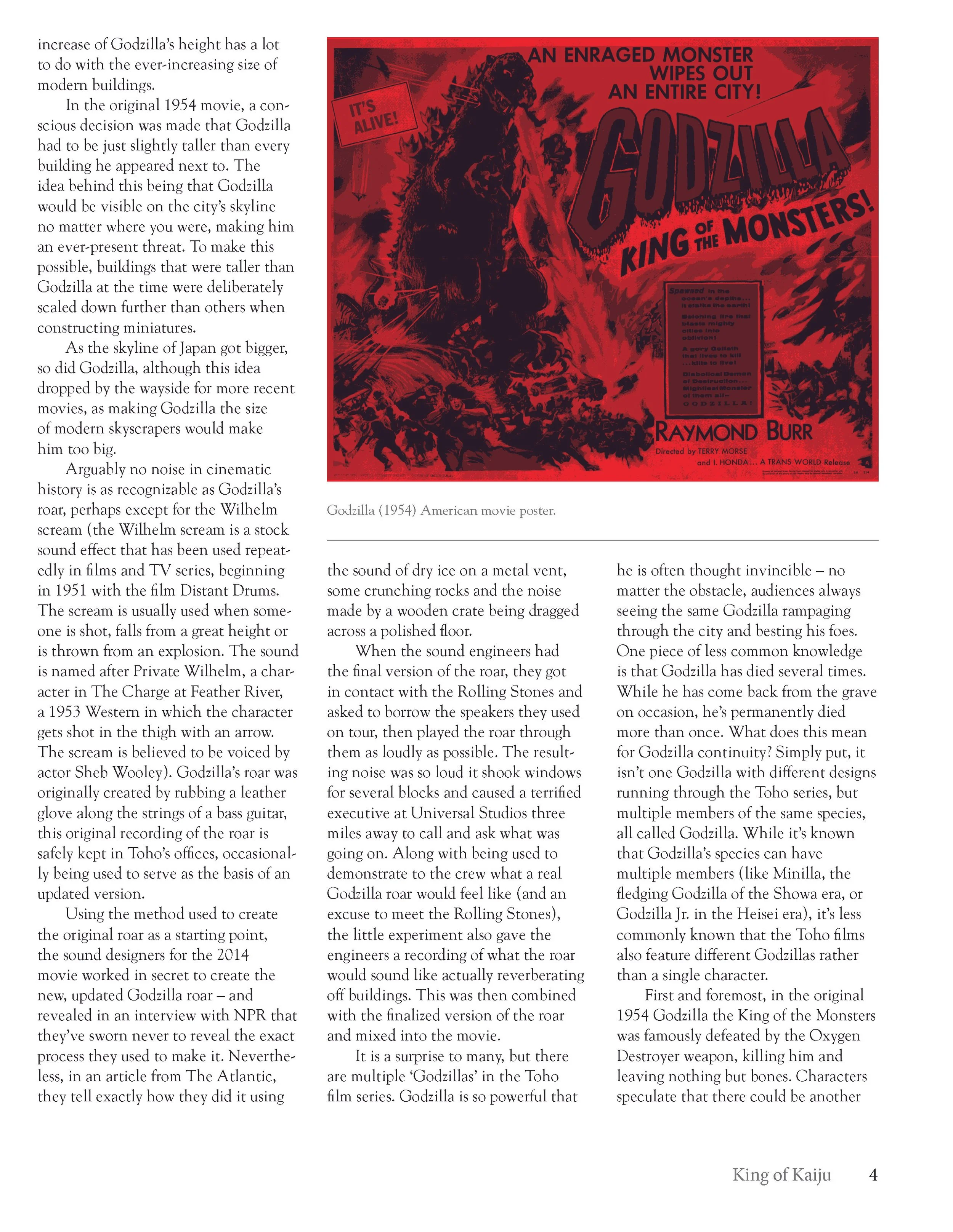
This was my first completed design project. For this piece, I was provided with a document of plain text and several images from which I was to compose a clean typographic layout. I incorporated a graphic of my own as well, a claw mark across the title to exemplify the intense and frightening nature of the film series. I utilized a red color scheme in order to further the symbolic association with danger, along with black and white to align with the original monochrome motion pictures.